IWBI Website
Senior design Director | urban emu
Overview
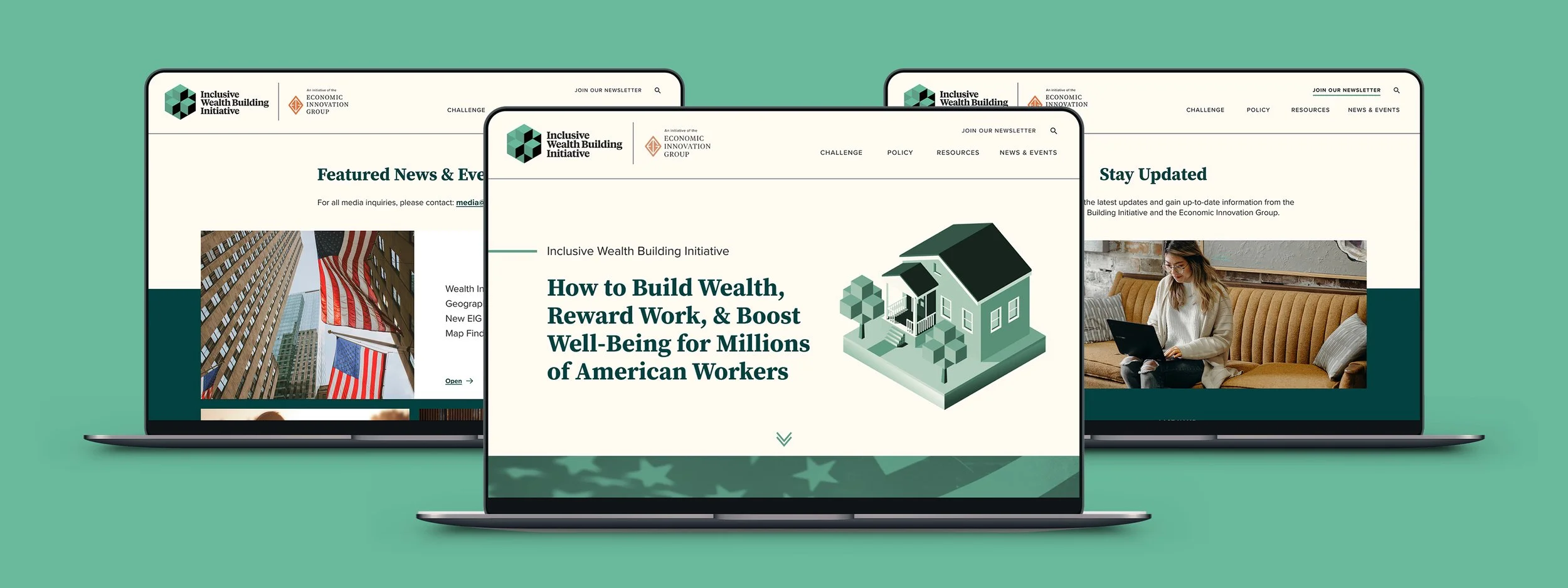
The Inclusive Wealth Building Initiative (IWBI) is a project of the Economic Innovation Group (EIG), another website I’ve worked on at Urban Emu. The initiative has a social activism focus aimed at helping to build wealth, while providing important resources and policy building action items. On a quick turnaround, we were tasked with redesigning the IWBI website to have a streamlined flow and storytelling approach. Prior, the website had a nonconventional layout posing functionality issues and visual inconsistencies.
My Role: As the Senior Design Director, I was the primary design lead on the website and brand graphic updates, while guiding a developer team.
Deliverables: website design, UX/UI, IA, branding
The Challenge
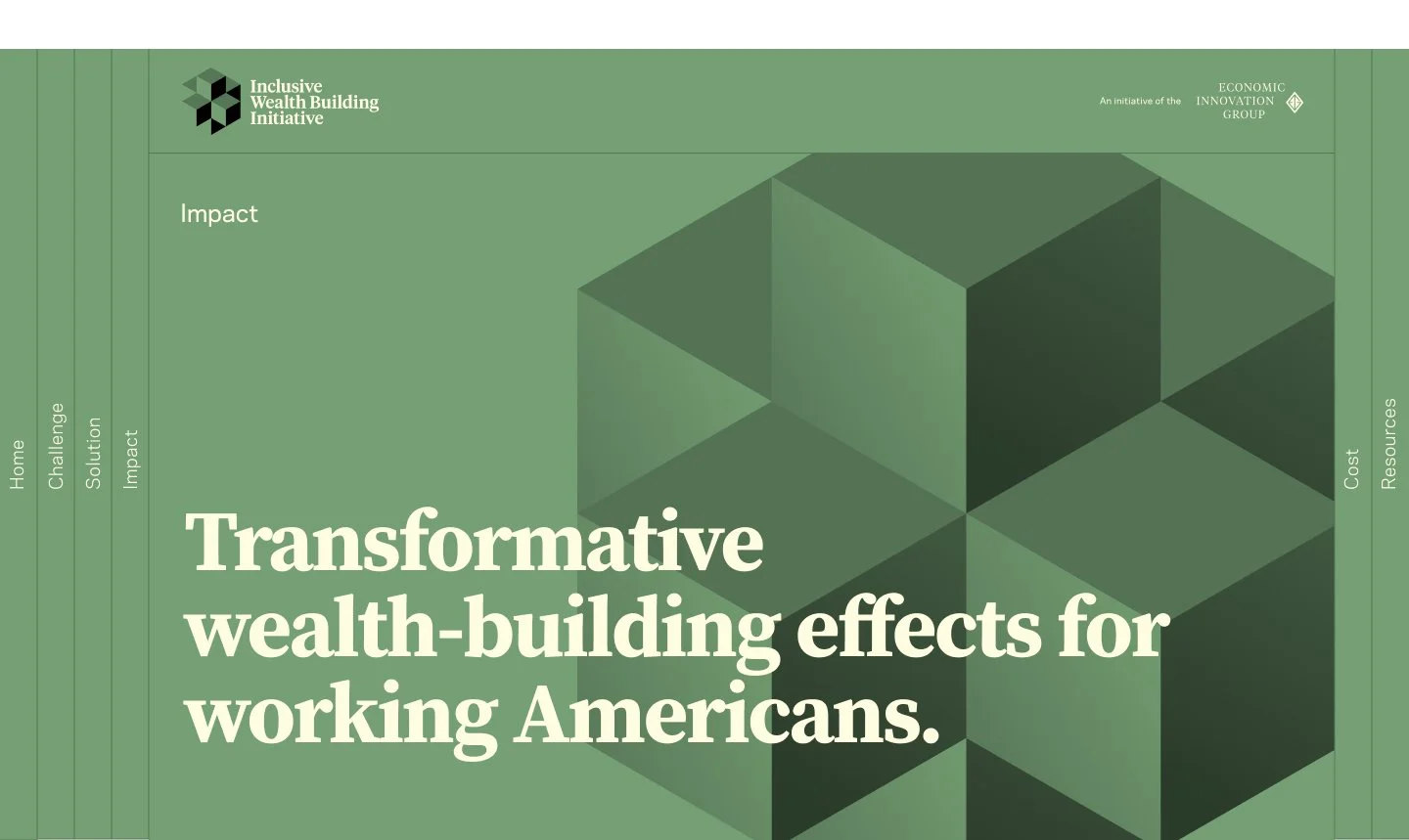
The client’s current website had engaging content, however, it used a side navigation that wasn’t user friendly and negatively impacted functionality. Issues such as slow load times, inconsistent color usage of the core brand, and the lack of a humanizing feel were prevalent. Creating an intuitive user experience with enhanced brand recognition and storytelling involved:
Taking a more straightforward approach to the website’s structure, while utilizing a cohesive visual hierarchy
Introducing new areas for additional resource types, while elevating call-to-actions and impactful visuals
Creating new branding assets for the website and marketing materials
Original website, navigation, and color reference
Information Architecture
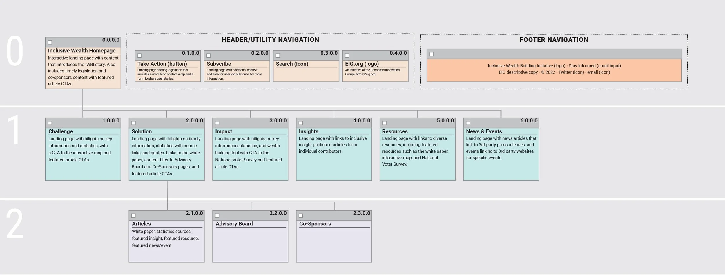
descriptive site map
A storytelling, step-like theme to the website was critical in the IA strategy. I focused on content ordering and prioritization, while incorporating new focus areas and additional pages. The client also requested a multi-page site map in a specific style (sample shown).
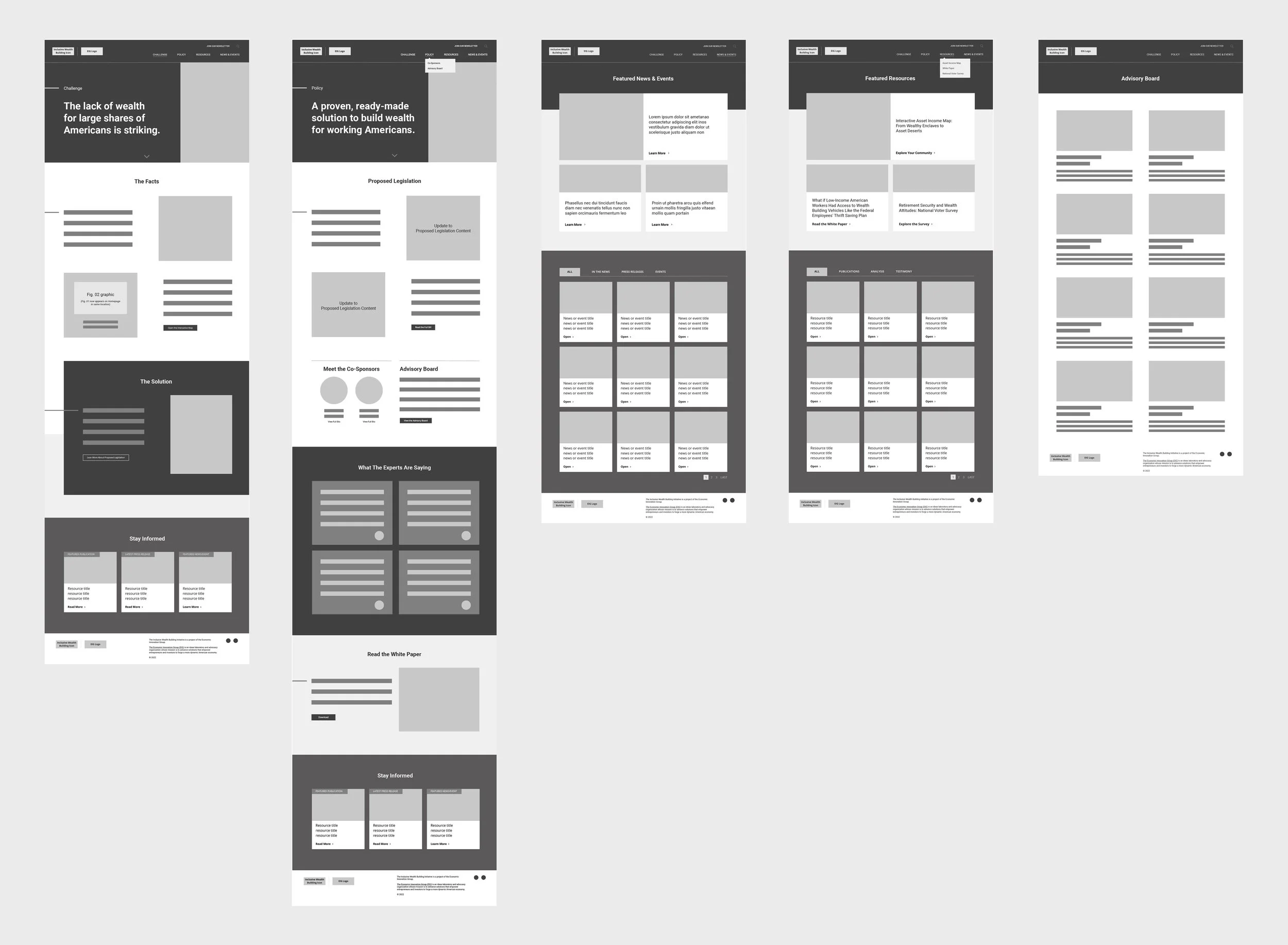
rapid low-fidelity wireframes
While typically I create wireframes in Figma as a best practice, upon client request to collaborate with the accelerated timeline, we created high-level Miro wireframes. This laid out basic structure and content zones.
The Solution
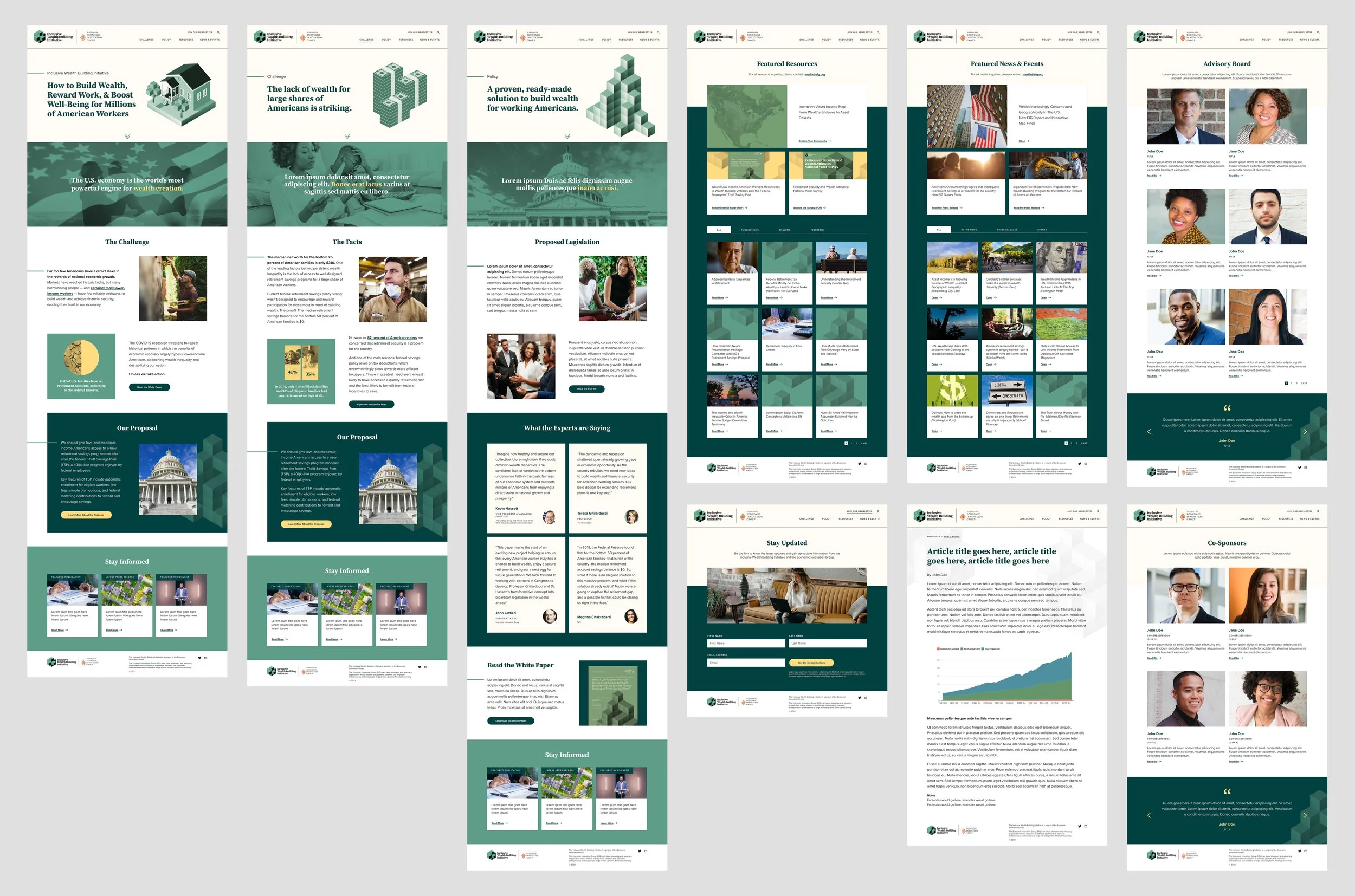
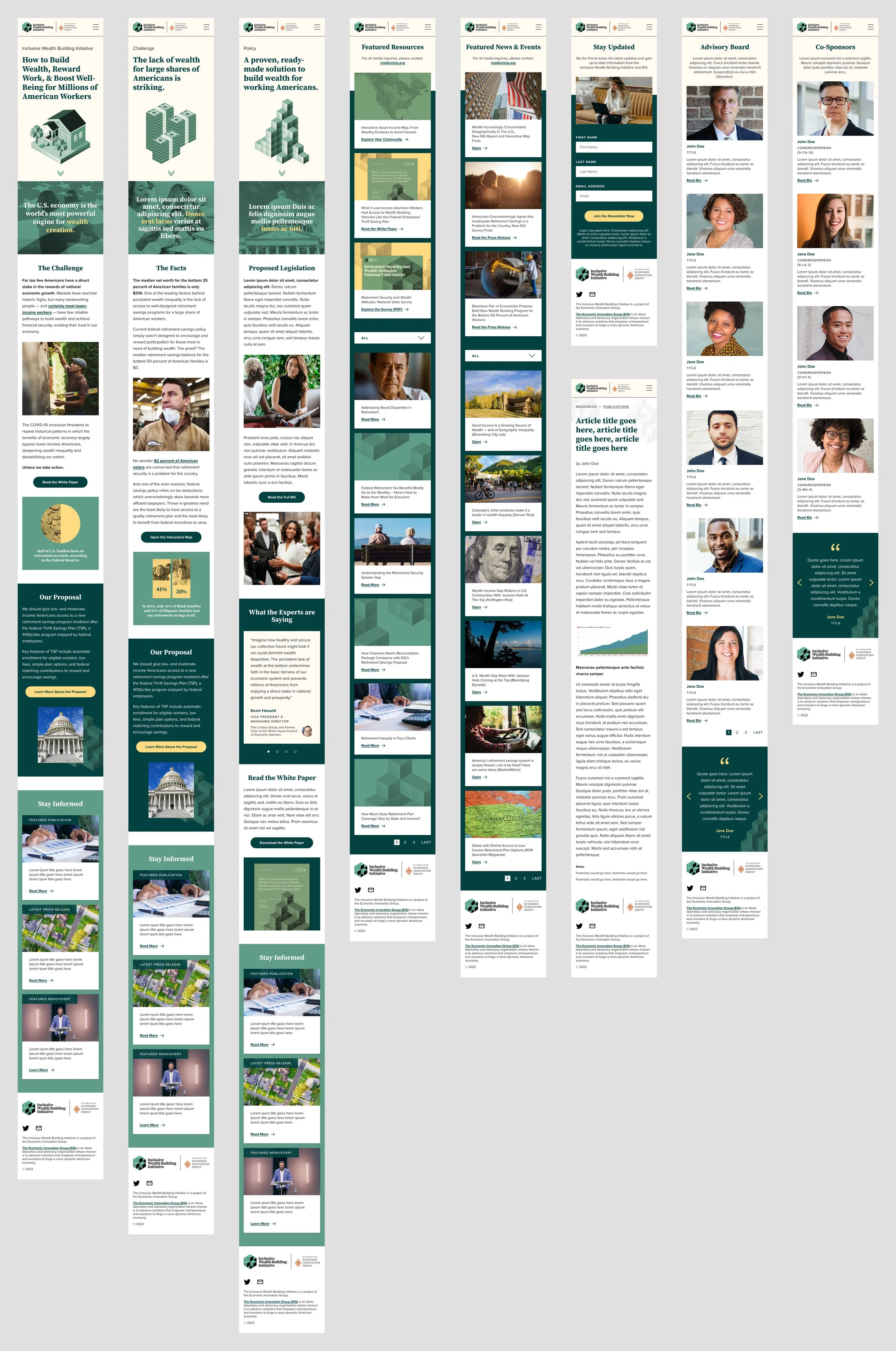
Following the wireframe phase, we quickly pivoted to desktop and mobile high-fidelity wireframes in Figma. Before building the full set, I experimented with color and treatment options. The client ultimately opted for distinct segments of color and content in comparison to their original monotone format. In addition, I implemented vibrant photography and graphics to better align with IWBI’s impactful mission.
eye-catching graphic treatments
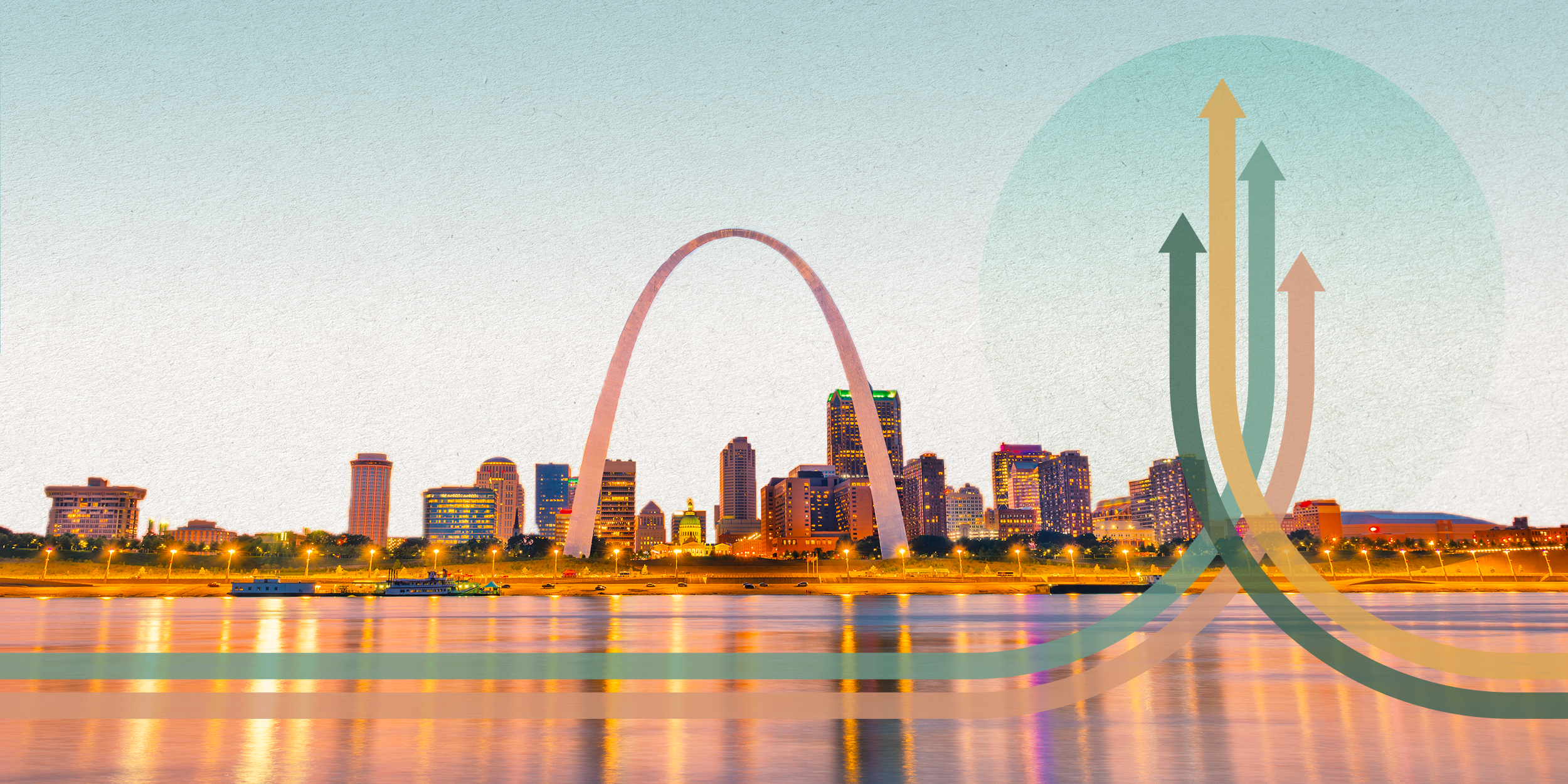
All graphics within the site that were illustrated or had a green tint overlay used animation effects to add visual interest, and draw attention to impactful copy. In addition, thumbnails for news and resource articles eventually took on brand consistency with IWBI’s parent brand, EIG, using a layered look and additional colors. A few resource examples I created are below.
The Result
The website successfully launched with its updated look and functionality, receiving positive feedback and new contributions from bipartisan leaders. It has been updated since with copy and content reflective of industry changes, and remains an important resource center for wealth building initiatives.


